

Here's how most industrial websites lose leads - they work like a catalog, not like part of the sales process for a team of 5-8 buyers. I show which pages you need (specs, certifications, RFQ forms), how to build a structure for hundreds of products without needing a developer for every change, and real examples from 3M, Amazon Filters, and Equinor.
.avif)


Most industrial websites lose leads not because they look dated, but because they treat a complex sale like a brochure download. Effective industrial website design fixes that – it builds B2B sites that explain technical products, engineering processes, and long evaluation cycles to several buyers at once, then guides each one toward a qualified inquiry.
Here's the reality: an industrial buying committee often runs 5 to 8 people, from the engineer checking tolerances to the executive weighing risk. Your site has to satisfy all of them without losing anyone. That means clear positioning, structured product pages, certifications placed where procurement actually looks, and conversion paths that don't hide on a contact tab.
Get it right, and your website stops decorating and starts selling.
So what does industrial website design actually mean in practice?

Most industrial sites are still treated as an online brochure. Pretty header, a product grid, a contact page – done. That mindset is exactly why so many of them fail to bring in real inquiries.
Industrial website design is the practice of building B2B sites that explain complex products, engineering processes, and technical services to several audiences at once, then guide each of them toward a qualified inquiry. Think manufacturers, engineering firms, equipment suppliers, and energy businesses selling things that take months to evaluate. These aren't impulse buys.
So what actually separates it from a standard company site? The job isn't emotional appeal – it's utility and technical clarity across a long sales cycle. An engineer needs specs and tolerances. Procurement wants certifications and terms. An executive wants proof it reduces risk. Your site has to answer all three without losing anyone.
That's why a strong industrial design website carries product pages with real documentation, application detail, certifications like ISO 9001, and visible paths to a quote – not just a rebranded header. A good industrial website design treats the site as a working part of the sales process, not decoration.
Done right, it does two things at once. It helps existing clients find what they need fast, and it turns curious visitors into qualified leads. That definition only matters once you understand why these sites behave so differently from a typical B2B marketing site.
A typical B2B site sells to one decision-maker. An industrial site sells to a room full of them, each with a different question.
That's the core challenge. Industrial b2b website design serves a buying committee – often ten or eleven internal stakeholders. The engineer wants tolerances and load capacity. Procurement wants contract terms and compliance. Finance wants total cost of ownership; the executive wants proof the risk is contained.
Can one page satisfy all of them? Not by accident. Website design for industrial companies must route each reader to the detail they care about without burying the others.
Then there's time. The median B2B sales cycle sits around 84 days, and complex industrial deals run far longer in most cases. Your site isn't closing in one visit – it's revisited over months as different people vet you.
That's the second pressure. Industrial manufacturing website design must hold technical accuracy that survives an engineer's scrutiny while staying readable for a non-technical approver – precision and clarity, together. Miss either, and you lose someone on the committee. This complexity shows up first on the homepage, where every stakeholder lands at once.
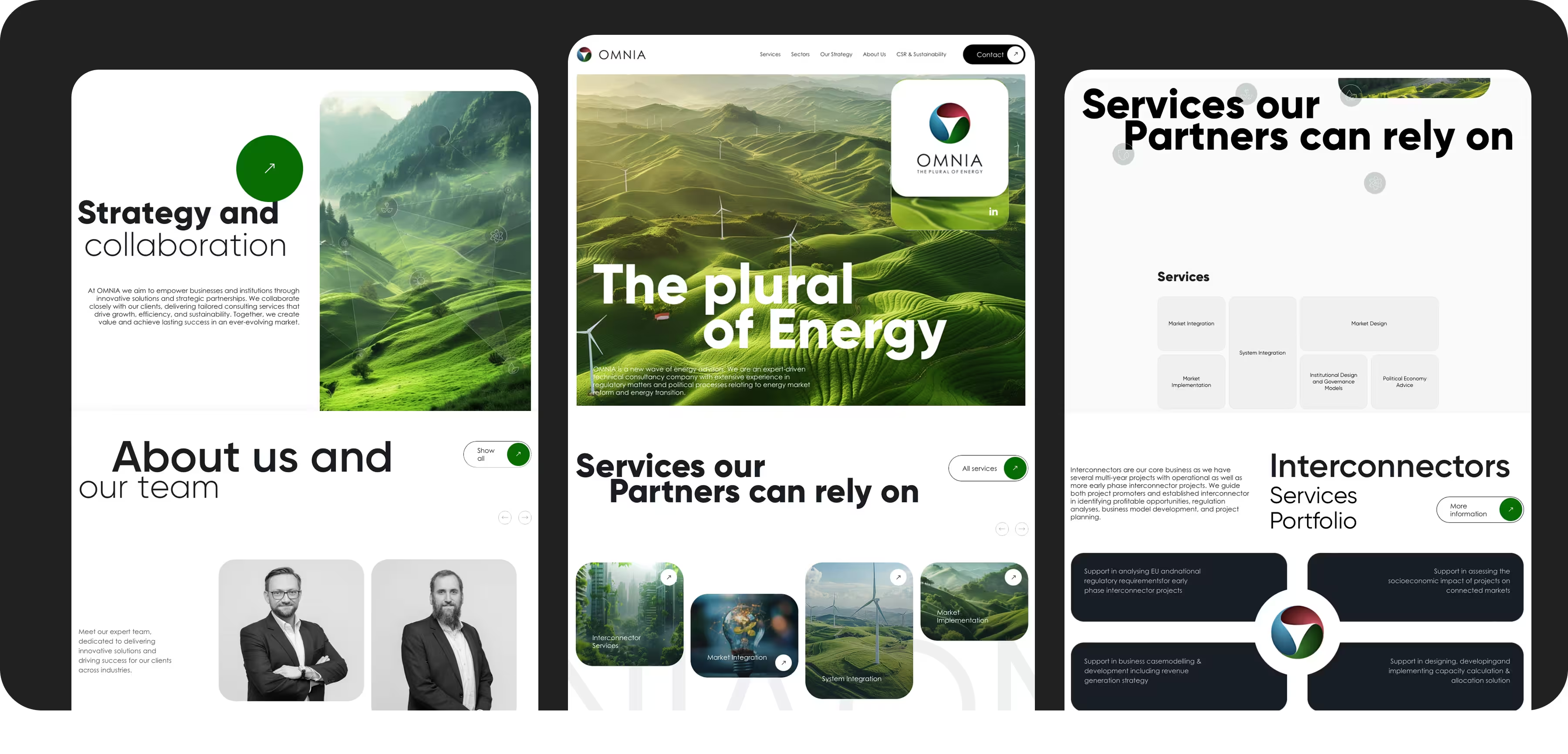
Where does an engineer go first? Where does procurement go? A generic hero that speaks to everyone speaks to no one.
Strong industrial homepages segment right from the fold. The most common path is by role – one entry for technical evaluators, another for buyers weighing cost and terms. Just as effective is segmenting by industry or application, so a visitor sees their use case reflected immediately.
A secondary path by product category catches people who already know the part they need. You give each visitor a door, not a maze. Segmentation on the homepage is only sustainable if the underlying page architecture is built to support it.
Skip a page type your buyers expect, and they'll assume you don't have it. Then they open a competitor's tab.
An industrial company website design runs on a specific set of pages, each doing a job. Start with product and service pages – dedicated to a single product or capability, with specs, features, high-resolution media, and downloadable resources like datasheets and CAD files. Multi-tabbed layouts keep detail organized without a wall of text.
Next come industry and application pages, so a visitor sees their exact use case reflected. Then technical specification pages and tables, where an engineer confirms fit fast.
Certifications matter too – and placement matters more. Put ISO 9001, AS9100, and IATF 16949 near the relevant products, not buried in a footer where nobody vets them. Pair them with case studies showing measurable outcomes to shorten evaluation.
Round it out with a project gallery, downloadable technical resources, and RFQ or contact forms built as reusable CMS blocks you can drop onto any page. That's the difference between industrial service website design that captures inquiries and one that lists offerings, and it's a core part of our Webflow design and development services.
Once you know which pages are required, the next challenge is organizing them so the site scales past 50 or 500 products.
Add 200 SKUs to a hand-built site? Someone codes each page by hand. That doesn't scale.
A CMS-driven product taxonomy fixes it. Define products once, then layer industry and application taxonomies on top so each item surfaces under every use case. New products slot into filters, industry pages, and search automatically.
Reusable Webflow components make that possible – spec tables, media blocks, and RFQ forms your team drops in without a developer. That's the flexible CMS architecture for growing catalogs you'll actually maintain. But content must speak to engineers and non-technical buyers.
How do you give an engineer full detail without losing the executive skimming for fit? Layer it.
Diagrams turn a complex process into something a non-technical buyer grasps in seconds. Comparison tables let procurement weigh options side by side. Spec sheets carry the exact tolerances and load figures an engineer verifies before trusting you – the precision that survives real scrutiny. FAQs catch the recurring questions before they become emails.
Good industrial website design stacks these so each reader pulls what they need. For more B2B website design insights, depth and clarity aren't opposites. With content structured and simplified, the remaining question is which execution details actually move the needle for conversions.
Here's the uncomfortable part: you can nail every page type and still lose leads to a slow, confusing site.
Start with a clear positioning statement above the fold, so any visitor knows what you make and who you serve in five seconds. Pair it with visible conversion paths – a quote button, an RFQ form, a datasheet download – on every page, not just the contact tab.
Speed is where the math gets loud. B2B sites loading in one second convert 3x higher than five-second sites, and mobile responsiveness compounds that since committees vet you from phones between meetings. Page load speed isn't a technical nicety – it's revenue.
Then there's structured data. Adding schema markup to product specs and case studies helps search engines interpret your content correctly, which surfaces richer listings and pulls more qualified clicks. Validate it, don't guess at it.
Round it out with SEO fundamentals – clean technical setup and industry keyword targeting matched to how buyers actually search. Want that handled properly? Our SEO optimization for B2B sites folds all of this into the build.
Best practices are easier to apply once you've seen them executed well, so let's look at real examples.
Polish gets attention. Clarity generates inquiries. The strongest industrial websites combine clear navigation, useful technical content, and visible trust signals that help buyers move forward.
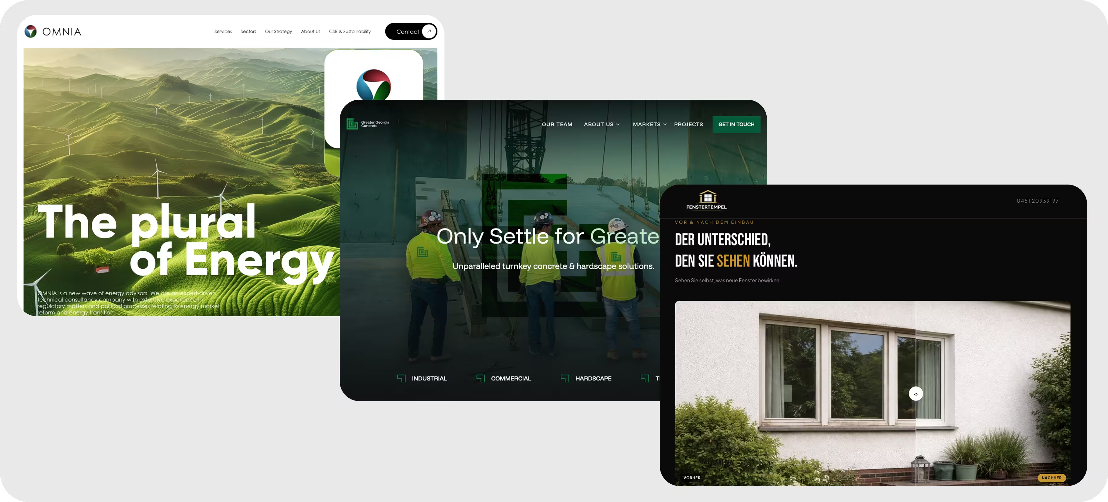
3M shows how a large industrial catalog can remain accessible through buyer-focused navigation, clear product categories, and content organized around applications and industries. The lesson is simple: a large product range does not have to create a confusing user experience.
Amazon Filters combines detailed product information with clear paths to sales support. Technical buyers can explore relevant solutions while procurement teams can quickly find the information needed to request a quote or speak with a specialist.
Equinor uses prominent reporting, project information, and sustainability content to communicate scale and accountability. This approach is especially effective for companies that must build confidence with executives, investors, partners, and public stakeholders.
Every example leans on trust signals to shorten a long buying cycle.
A multi-month evaluation is really a series of small trust tests. Pass each one, or someone on the committee quietly rules you out.
Case studies carry the heaviest load here. They reduce perceived risk and speak to several stakeholders at once – an executive reading ROI, procurement checking outcomes. That's why case studies significantly influence 73% of B2B decision-makers, yet so few companies use them well.
Testimonials do work – your own claims can't. Buyers trust peer experiences over vendor statements, so a named quote from a plant manager lands harder than any headline you write.
Certifications provide the compliance proof procurement won't skip. Place them where the vetting happens – beside the relevant product, not stranded in a footer. Then show the work itself. A well-organized industrial design portfolio website section, with real project galleries, lets engineers see scale and execution before they ever email you.
Ever wonder why polished sites still lose deals? Usually the proof is thin. Trust signals build confidence, but they only convert if the site is engineered to capture the inquiry when confidence peaks.

A catalog waits to be found. A lead engine goes looking. That's the difference most industrial sites never close.
Good industrial website design services build structured conversion paths into every page – an RFQ or quote form where intent peaks, not stranded on one contact tab. Make it easy for a buyer to ask for a number the moment they're ready.
Gated technical resources deepen the pipeline. Put a detailed datasheet or design guide behind a short form, and you'll capture serious prospects – top B2B teams see 10-15% conversion on gated offers. But gate too aggressively and you lose early researchers, so calibrate: gate high-value assets, leave discovery content open.
Then wire it into your stack. Webflow forms connect natively to HubSpot and, on Enterprise, to Salesforce and Marketo; Pardot slots in the same way for automation-heavy teams. Every submission lands as a routed CRM record – no lost contacts.
Layer analytics and lead tracking on top so you can see which resource actually sourced the deal. Want this built into your site rather than bolted on? Book a call and tell us about your project.
Getting these mechanics right consistently is exactly what separates a capable Webflow partner from a template vendor.
A polished homepage is easy to buy. A partner who thinks past launch day is not.
At a meaningful project budget, you're not shopping for a template – you're picking someone to grow with. Start with Webflow expertise at the systems level. The right team thinks in structure and long-term growth, not just visuals. They plan CMS architecture and performance beyond the first deploy.
Then check CMS flexibility. Ask how they handle reusable components, a predictable class system, and scalable collections that survive catalog growth. Can your marketing team publish a new product without a developer? That answer tells you a lot.
SEO and performance come next – clean semantic HTML, structured data, fast CDN-hosted pages that hold their Core Web Vitals.
Now the real test: long-term support. Ask how long their average client relationship runs. If it's one project and done, you've found a build shop, not a growth partner.
Skip price-only comparisons. Weigh value – expertise, quality, and transparent pricing that names what you're paying for. That's what a genuine industrial website design agency offers.
Ready to vet one properly? Talk to our team about your project.
Here's what this actually looks like when we apply it to real industrial engagements.
Patterns emerge when you build enough of these. Across Webflow projects for manufacturers and energy companies, the sites pulling the most qualified RFQs keep repeating the same three traits, so we now build them in from day one.
First, segmented navigation by stakeholder role. When the engineer, the procurement lead, and the executive each get their own entry point, they stop bouncing off a generic homepage and start finding proof that speaks to them.
Second, a CMS taxonomy that survives catalog growth. Add a new product line, and it should slot into filters, industry pages, and search on its own – no developer ticket. One equipment client scaled its catalog significantly larger without touching the underlying structure.
Third, gated resources tied into CRM. A datasheet behind a short form only earns its keep when the submission lands as a routed record your sales team acts on. That's where good industrial website design stops being a catalog and starts feeding a pipeline.
Would any single trait carry a site alone? Not really. Together they compound – segmentation earns attention, taxonomy keeps it organized, and connected forms turn interest into a tracked
A great industrial site isn't the one with the slickest header. It's the one that answers an engineer, a procurement lead, and an executive on the same visit, then makes the inquiry easy when confidence peaks.
Every piece we've covered points the same direction. Segment by stakeholder, build a CMS taxonomy that survives catalog growth, place your certifications and case studies where vetting actually happens, and wire forms into your CRM so no lead slips. Speed and structured data quietly do the rest.
Where does that leave you? With a site that works as part of the sales process instead of sitting beside it.
If you want to see how these principles play out on real projects, our B2B website case studies show the structure behind the results. For deeper reading on execution, our blog breaks down the tactics one at a time.
Ready to build one that generates qualified inquiries? Book a call and tell us about your project – we'll map it to your catalog and buyers.
Ready to move on to your own site?
Book a call and tell us about your project. Tell us the one objection costing you signups, and we'll start there together.
.svg)
You're selling to a buying committee of 5-13+ stakeholders – engineering, procurement, finance, executives – each with conflicting priorities. Longer cycles demand more trust content, and large technical catalogs need CMS taxonomy, not static pages.
Quality Webflow builds typically start at a moderate budget and scale with catalog size and CMS complexity. Cost depends on product and industry page count, custom interactions, and integrations like CRM or ERP. Judge value on support and lead generation, not sticker price.
Product and service pages with specs, media, and downloadable datasheets. Industry and application pages. Certifications placed near relevant products, plus case studies, project galleries, and a resources or downloads hub.
Layer detail progressively with comparison tables, diagrams, and FAQs. Pair plain-language summaries with full spec sheets for non-technical buyers. Let engineers drill down via downloadable CAD files or datasheets instead of forcing that onto everyone.
Yes. Its CMS supports reusable components and scalable taxonomy for large product catalogs. Marketing teams update content without developer bottlenecks, and it integrates with CRM and marketing automation for lead routing.
Typical timelines vary depending on catalog size and custom templates, with complex catalogs taking longer. Discovery and IA planning for complex lines often takes longer than visual design. Phased launches – core pages first, full catalog after – speed time-to-market.





.avif)



.avif)